
Brand Design
Corporate typography: Balancing readability and character
Choose corporate typography through real content tests, language support, numbers and mobile layouts while balancing readability with brand character.
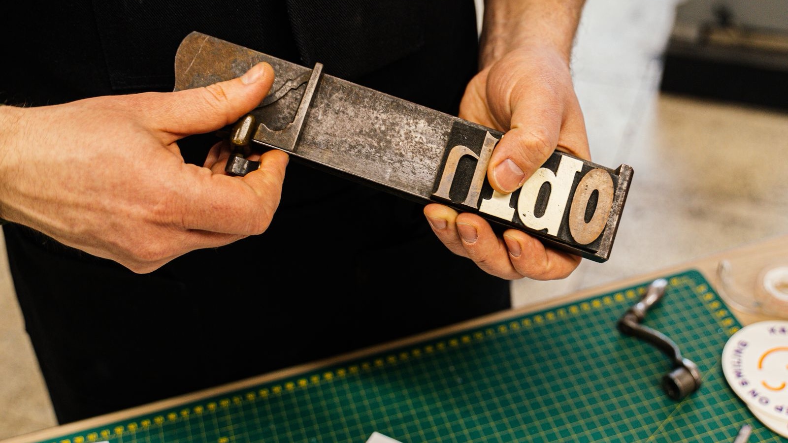
A presentation heading looks distinctive, but the same typeface becomes tiring on the second page of a proposal. Numbers that seem elegant on the website are difficult to distinguish in a pricing table. This is where corporate typography becomes a practical design problem. A font that gives a short word personality may not handle the organisation's everyday information equally well. The task is to preserve a recognisable voice while helping people read, compare and act.
The answer involves more than a font name. Heading scale, paragraph width, line spacing, emphasis and suitable alternatives work together. Sales staff preparing a proposal and editors adding a service page should not have to invent those relationships each time. Useful typography guidance gives them a dependable starting point, while allowing enough flexibility for the content they actually need to publish.
Compare fonts on a working page
It is tempting to judge a typeface through the logo or a short slogan. Daily communication usually contains longer service names, explanations, prices and footnotes. Test candidates using the same realistic content. A service page, a two-page proposal, a table and a mobile form make a useful initial set. Comparing the most attractive specimen for each candidate hides differences; comparing the same reading tasks makes those differences visible.
Imagine a fictional technical consultancy presenting three service packages. The headings are long, the comparison contains many numbers and customers need to understand scope quickly. A condensed font might fit the headings while making longer paragraphs uncomfortable. A characterful rounded family could feel approachable but perform differently in dense numerical information. These possibilities are reasons to test, not rules about which style a sector must use.
Give headings and body copy different jobs
Headings attract attention and reveal the structure of a page. Body copy carries the explanation and needs to remain comfortable over longer passages. One family can serve both purposes. If two are chosen, the relationship between them should be deliberate. A decorative heading face does not make the body choice unimportant. Compare proportions, weight and letter shapes together rather than selecting each family in isolation.
Using two fonts is not a requirement. Appropriate weights within one family can provide enough hierarchy for many organisations. Additional families also add licensing, file management and application decisions. Identify an unmet need before expanding the system. A campaign may justify a separate expressive face while corporate documents retain their main typography. Recording that distinction prevents a temporary campaign treatment from quietly replacing the permanent identity.
Check the characters your business actually uses
For Turkish content, test Ç, Ğ, İ, Ö, Ş and Ü in the relevant weights and cases. Dotted capitals, accents within tight leading and heavier character forms can reveal issues that an English specimen does not show. Presence in the character set is only the beginning; the forms should look coherent in real words. Include the company name and frequently used service terminology in the test material.
For bilingual publishing, review both languages in the same components. Translated headings can have different lengths and line breaks. A compact English label may become a longer Turkish phrase that no longer fits the original card. Shrinking the translation is not always the right response. The layout may need more flexibility. Typography rules should accommodate realistic language differences rather than make one version consistently less readable.
Inspect numbers in proposals and reports
The most important information may be a total price or delivery date rather than a brand statement. Compare potentially confusing forms such as zero and capital O, or one and lowercase l, within realistic strings. In financial tables, alignment, decimal separators and currency symbols influence scanning. Where the font and software support useful numerical options, test whether those options improve the actual document.
Add long product names, missing-value indicators, percentages, negative values and different currencies. Check that rows remain distinct and totals are easy to locate. Put numerical rules into the template so staff are not expected to remember them for every document. A pricing table that behaves correctly by default is more useful than a sophisticated feature demonstrated only in the identity presentation.
Adjust size, spacing and measure together
The same point size can appear different across typefaces because proportions and stroke characteristics vary. Review the result rather than relying on a number. Compare short headings, extended paragraphs and small supporting text. Tight line spacing can make reading difficult, while excessive spacing can disconnect lines from their paragraph. A sensible balance depends on the chosen face, the content and the medium.
Paragraph width matters too. Long lines can make it harder to locate the next line, while narrow columns can fragment words and phrases. A desktop arrangement needs separate consideration on a phone. Simply making the text smaller may conceal a layout problem. Review padding, columns and heading breaks together. The page should still work when an editor adds a longer service title than the demonstration used.
Enlarge text to test the layout
Review text enlargement up to 200 percent without loss of content or functionality, accounting for the relevant exceptions. This brings navigation and form labels into the review as well as paragraphs. Text that disappears inside a card or overflows a control can reveal an arrangement too dependent on one fixed size. Treat enlargement as a design test, not an optional final decoration check.
Build hierarchy without constant emphasis
Bold, italic, coloured and uppercase text competing inside one paragraph can make priority less clear. Give emphasis techniques specific roles. A section title can be prominent, supporting copy quieter and links distinguishable. If every sentence tries to attract attention, the genuinely important detail loses its position. Typography should reveal the editorial hierarchy rather than compensate for an unresolved one.
On websites, semantic structure matters alongside visual size. Marking every bold phrase as a heading distorts the content outline; presenting real section headings as ordinary paragraphs can make navigation harder. Content and design teams should agree on the structure. Sample pages within a brand design project can demonstrate how visual treatment and meaningful hierarchy work together in the applications the organisation will maintain.
Make fallback choices part of delivery
A website font may fail to load, or a document may open on a computer without the chosen family. Test what happens. A website can define a prioritised list of font families and a generic alternative. Test that alternative with the real content too. A fallback affects line lengths and layout, so it deserves a design decision rather than remaining an unnoticed technical default.
Similarity of mood is not enough. Compare line wrapping, numbers and weight behaviour. Open proposals in the office software the recipients and internal staff are expected to use. Establish whether employees have the required fonts and how legitimate installation will be handled. These practical arrangements reduce the likelihood that individuals substitute whatever they happen to find on their own computer.
Review licensing against the workflow
Permission for commercial use does not necessarily explain every deployment. Desktop work, web presentation, application embedding and editable template sharing should be assessed against the relevant licence. Record the font, provider, version and licence source in the handover material. When the team expands or a new channel is introduced, staff should know where to check the applicable conditions.
Choosing a typeface the organisation cannot maintain creates a problem beyond visual style. Discuss cost, installation and working tools at the beginning. Openly licensed options still need accurate source and licence records. Instead of distributing font files casually, organise access in a way consistent with the relevant permissions. Typography becomes sustainable when its operational requirements are considered alongside its appearance.
Give the team one complete specimen page
Show a main heading, subheading, paragraph, table, link and footnote together. Explain where the styles are located and what users may change. A new employee should be able to prepare a sensible document by following the example. If every minor update requires the original designer, the system may become difficult to maintain as the organisation grows.
Finish by adding unfamiliar content: a long customer name, a two-line service title and a more complicated table. Does the identity remain recognisable while the information stays clear? Before replacing the typeface, consider whether scale, spacing or the usage rule needs adjustment. Good corporate typography does not demand attention everywhere. It carries the brand's tone while helping the reader complete a task.
Frequently asked questions
How many font families should an identity use?
One or two can cover many requirements, but there is no universal rule. If the same family handles headings, long copy and data well, adding another may be unnecessary. An additional choice should solve an identifiable problem. Record its role, licensing and availability in the team's tools so the extra option does not become an arbitrary alternative.
Are serif or sans-serif fonts easier to read?
The category alone cannot settle the decision. The particular design, size, spacing, passage length and viewing environment all matter. Both groups contain faces suited to different tasks. Compare candidates with your own headings, paragraphs and small supporting copy under consistent conditions. A practical test provides a stronger basis than a general rule about the category.
What if a preferred font handles Turkish characters poorly?
Check the version and character coverage first. If support remains unsuitable, consider another family or an appropriate solution reviewed by a qualified specialist. Filling missing letters with an unrelated font can create visible inconsistency. Testing the company name and important service words early reveals the problem before the handover package is built around the choice.
Must the website and presentations use exactly the same font?
Consistency can benefit from a shared family, but licensing, software and technical requirements may justify coordinated alternatives. Preserve a clear hierarchy, compatible proportions and the intended tone. Define those alternatives in the guide. Employees should not have to invent a new substitution whenever a file moves to a different application.
Does changing typography mean changing the whole identity?
The effect depends on the scope. Improving body-copy readability differs from redrawing the lettering in the main logo. Consider existing recognition and the cost of updating applications. When a change is justified, plan the transition across templates, the website and documents so the organisation does not end up maintaining several conflicting systems.