
Social Media Management
Instagram Profile Design: What First-Time Visitors Need to Understand
Review your Instagram biography, links, visual identity and contact journey to help first-time visitors understand your business and find the right next step.
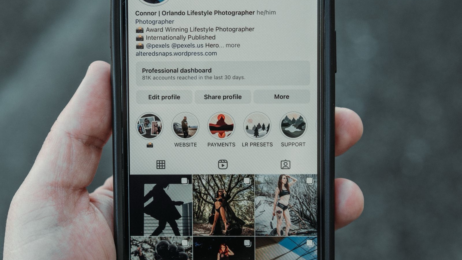
A visitor opens the profile, sees the logo and reads: “Making a difference in the digital world.” After scrolling through several attractive posts, they still cannot tell whether the business builds websites, manages advertising or sells a product. A contact link is available, but they do not yet know what to ask. Instagram profile design needs to close this information gap.
The name, biography, prominent content and links form an introductory route together. Visitors should recognise the business, understand whether it addresses their situation and find a suitable next step. That does not require compressing every service onto one screen. Choosing priorities and moving detail to the right destination is often more useful. The business examples below are hypothetical. Review the profile using only what a first-time visitor can see, rather than the background knowledge the team already holds.
Define the context of a first visit
People arrive for different reasons. One visitor may follow an advertisement, another may open a post shared by a colleague and a third may search for the business by name. Their starting knowledge differs. The advertising visitor may want the continuation of a particular offer, while the name-search visitor needs to confirm that this is the correct account. A profile written only for existing followers can omit explanations that newcomers need.
Choose a priority situation for the first review. A hypothetical web design business in Ataşehir might focus on an owner considering a replacement for an outdated company website. That person may need to understand scope, working process and contact options in that order. Every profile element does not need to explain everything at once, but the essential sequence should remain visible. Location can provide useful context when in-person or regional services genuinely matter.
Make the brand recognisable across channels
The account name, displayed business name and profile image should support each other. Visitors should be able to connect the name they saw on a website with the social account in front of them. Campaign-specific names or unexplained abbreviations can interrupt that recognition. Instead of filling a name field with repeated keywords, choose an accurate description that helps people identify the business. Clarity is different from a collection of search terms assembled without readable meaning.
Review the profile image at a small size. The details of a complex logo may disappear when reduced. An appropriate logo variation, sufficient surrounding space and clear contrast can make recognition easier. Do not stretch the mark to fill its container. Check it on the actual profile as well as in the design file. Cropped edges or unreadable lettering can remain unnoticed on a large design monitor and become obvious only on a phone.
Give the biography a job beyond sounding impressive
A short biography needs purposeful sentences. It should communicate what the business offers, whom it helps and an appropriate next step. A statement such as “making a difference in the digital world” does not explain a service by itself. More concrete language can identify the priority area, whether custom software, website design or brand communication. Rather than compressing every service into a dense line, establish enough focus to help the visitor choose where to explore.
Check whether claims can be supported. Words such as best, leading or guaranteed should not be added simply because they sound confident. Describing scope is often more informative. “We develop websites and administration interfaces for businesses” gives readers a clearer understanding of the offer. This is an example of a writing approach, not a biography every company should copy. The actual service scope, audience and brand voice should determine the final wording.
Make the link answer the next question
A profile link and its destination should create the same expectation. Someone looking for service details should not land on an unrelated, complicated campaign page. A contact invitation should lead to a contact route that works. More links are not automatically more useful. Visitors need to understand the differences between available destinations and which one fits their situation. Clear labels can reduce the work of interpreting an unexplained web address.
Open each destination from a phone. Does the page load, show the right language and provide usable form fields? Are contact details current? Improving the profile is unfinished work if the destination fails. Repeat this check when campaigns change. An expired offer can create the wrong expectation if its link remains prominent. Responsibility therefore extends beyond the social media specialist to the people maintaining the website and the underlying offer.
Treat prominent content as an information structure
When choosing prominently displayed content, consider more than the highest engagement total. An introduction can explain what the business does, a process explanation can show how work happens and an appropriate example can clarify the needs it addresses. This is not a mandatory three-post formula. The aim is to answer distinct introductory questions rather than repeat one message. Check available display features in the account's current interface instead of relying on an old screenshot.
If the profile uses story highlights, give them names visitors can interpret. Icons alone may leave categories ambiguous. Labels such as Process, Services or Questions can explain what the collection contains. Open each category and check for outdated prices, ended campaigns or changed contact details. A current biography above an archive containing obsolete information can produce contradictory expectations. Prominent content needs maintenance, not only an initial design session.
Distinguish consistency from uniformity
Every post does not need the same colour and layout. Consistency can come from typography, image quality, colour choices and a recognisable tone. Different information requires different treatment. Forcing a team photograph and a technical comparison into the same template can weaken both. A design system should be flexible enough to make the message understandable rather than demand that every subject look identical in the profile grid.
Review individual posts as well as the complete feed. People often encounter content away from the profile. A fragmented image that makes sense only beside neighbouring tiles may feel incomplete in isolation. Small lettering, low contrast and heavy decoration can obscure the message. When the visual foundations are unclear, brand design work can establish rules that remain recognisable while accommodating different subjects. The purpose is communication, not simply a coordinated screenshot.
Match service explanations to customer questions
Visitors should be able to find out what the business does, but a long service list is only a starting point. They also need to recognise which service corresponds to their own requirement. A company asking for social media management may not yet distinguish visual production from planning, publishing and reporting. Short explanations and relevant guides can make these differences visible without turning the biography into a complete catalogue.
A scope explanation and a request for a proposal serve different purposes. Instead of forcing every newcomer to send a message immediately, provide a useful way to learn first. A page describing the scope of social media management can help visitors evaluate how responsibilities are shared. Use consistent definitions between the profile and service page. Differences in wording should not imply that the same service includes different things in different places.
Check the operation behind the contact invitation
A clear contact prompt requires a clear owner. Messages lost between several team members can undermine the expectation created by a well-presented profile. Agree who monitors the channel, what operating hours apply and how questions needing specialist input are passed on. Not every enquiry can receive an immediate price, but the team can explain what information is needed and what happens next. The route should remain understandable even when an instant answer is impossible.
Avoid asking customers for private information in public comments. Order references or technical account details should move to an appropriate private channel when required. Offer contact options the team can actually maintain rather than displaying every possible method. A phrase such as emergency support should be used only when the service truly exists. The communication promise should match operational capacity, including the ability to recognise and route sensitive issues.
Test the profile with someone unfamiliar with it
Ask a person who does not know the business to explain what it offers and how to contact it. This small exercise can reveal ambiguity the design team no longer notices. Do not turn the test into a sales presentation; listen to what the visitor understood first. Adding more text is not always the answer. Changing the service priority or replacing an unclear link label may solve the problem more effectively.
Look at the nature of incoming questions when assessing a profile change. If visitors still ask what the business offers, the biography may lack a clear priority. If a link works but leads to the wrong information, correct its destination. Consider profile visits and relevant link activity alongside these observations. Advertising or offer changes in the same period also affect the result, so investigate where visitors struggle rather than attributing every change to design.
Frequently asked questions
Should the biography list every service?
Prioritising clearly described services may be more useful than including an exhaustive list. Too many items can make the business's focus difficult to recognise. Move detail to relevant service pages or explanatory content. The short introduction should establish an accurate frame, allowing visitors to understand what kind of business they are considering before they choose a more detailed destination.
Does the profile need a local location reference?
Location helps when face-to-face service or a particular region matters. A remote business should avoid suggesting a narrower service area than it actually supports. Instead of repeating Ataşehir for visibility, explain the real working arrangement. Location information should be correct, current and consistent with how the service is delivered. It provides context rather than a guarantee of search performance.
Should all posts use the same template?
No. Consistency does not mean every item must look like a duplicate. Typography and visual quality can remain coherent while different subjects use different arrangements. The design needs to help each post communicate as well as support the overall profile. A template that reduces readability should be adjusted rather than protected simply because it matches the rest of the feed.
Will a redesigned profile guarantee follower growth?
No. A clearer profile can help visitors understand the business, but follows and sales depend on many factors. Content, audience, offer and distribution need to be considered together. Evaluate profile improvements through access to information and consistency of expectations instead of promising a specific growth outcome. Attractive presentation cannot compensate for an unsuitable offer or inaccurate service description.
When should the profile be reviewed?
Check it whenever services, links or contact details change. The beginning and end of a campaign are useful review points too. A routine check should include prominent content and the pages reached through profile links, not just the biography. A recurring schedule can help ownership remain visible, but important factual changes should be corrected promptly rather than waiting for the next review.